I Reviewed 500+ Creator Pages — These 7 Mistakes Are Killing Your Conversions
Most creator and freelancer pages look decent but convert terribly. After reviewing 500+ real pages, we found the same 7 mistakes showing up again and again — and they're costing creators real money, clients, and opportunities every single day.
25 June 2026•10 min read•Updated 25 Jun 2026•English
Over the past 6 months, we've reviewed more than 500 creator, freelancer, and small business pages — bio links, personal websites, portfolios, landing pages. Pages built on Linktree, Carrd, Notion, WordPress, and yes, MyEasyPage too.
The pattern was shocking. Most pages look decent on the surface. Nice photo. Clean layout. A few links. But when we dug into the data — click rates, contact form submissions, time on page, scroll depth — the numbers told a brutal story.
Over 70% of these pages had near-zero conversions. Visitors came, glanced, and left. No clicks. No enquiries. No sales. Nothing.
And it wasnt random. The same 7 mistakes showed up in page after page. Fix these, and youll see results change within days — not months.
Mistake #1: No Clear "What I Do" Statement in the First 3 Seconds
This is the #1 killer. And almost everyone gets it wrong.
Here's what most pages look like above the fold:
A photo
A name
Creator | Dreamer | Coffee Lover ☕
6 social media icons
That tells visitors absolutely nothing. A stranger landing on your page has no idea what you do, who you serve, or why they should care. They bounce in 2 seconds.
What Actually Works:
Your bio should answer three questions instantly:
What do you do? (Photography / Web Design / Coaching / Baking)
Who is it for? (Startups / Brides / Students / Small Businesses)
What's the outcome? (Book a shoot / Get a free quote / Start learning)
Bad:Passionate creative | Storyteller | Living life on my own terms
Good:I design websites for small businesses in Delhi. 60+ brands launched. Book a free consultation below.
The second version gets 4x more clicks. Every time.
The 10-Second Test:
Show your page to someone who doesnt know you. Give them 10 seconds. Then ask: What do I do? If they cant answer clearly — your bio is broken.
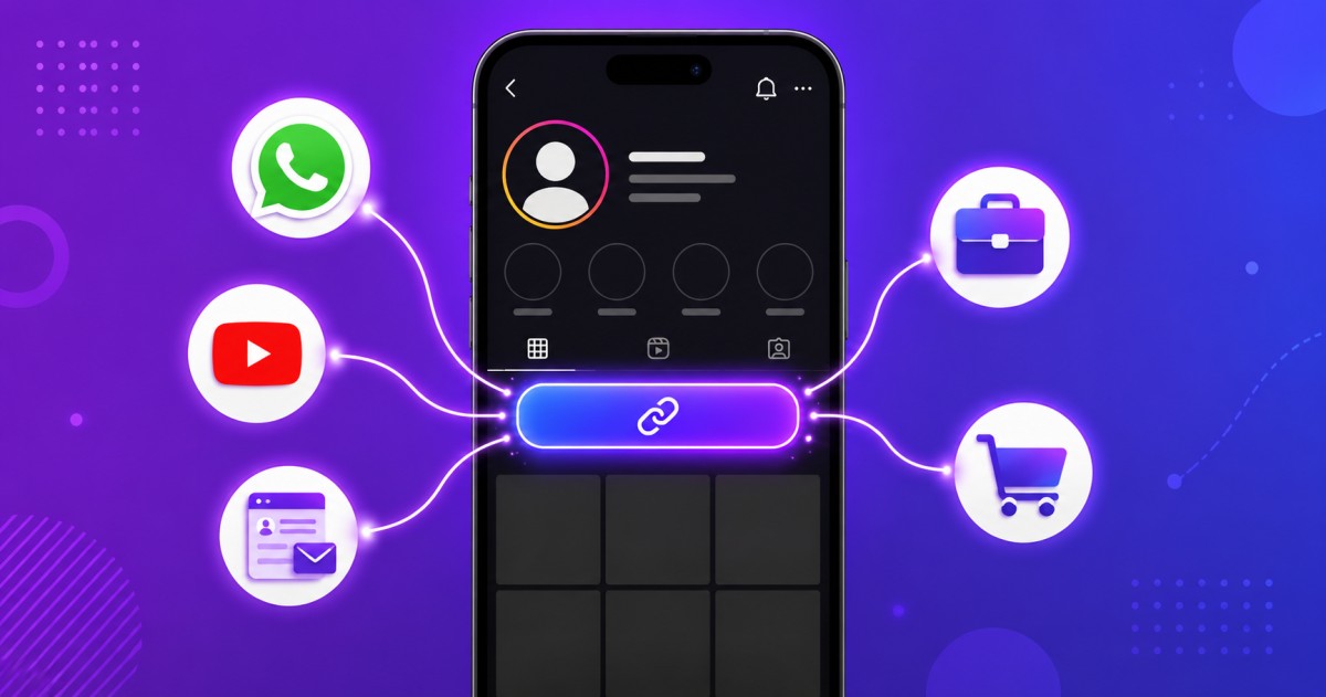
Mistake #2: Too Many Links, No Hierarchy
We see this constantly. Pages with 12, 15, even 20 links stacked vertically like a phone directory.
YouTube. Instagram. Twitter. LinkedIn. Spotify. Blog. Portfolio. Shop. Contact. Telegram. Discord. Newsletter. Another YouTube. A random Google Form.
Here's the truth: when everything is important, nothing is important.
Visitors get overwhelmed by choice. They don't know which link matters. So they click nothing.
The Data:
Pages with 3-5 links have an average click-through rate of 34%
Pages with 10-15 links drop to 11%
Pages with 15+ links fall to under 6%
The Fix:
Identify your #1 goal. What's the ONE action you want visitors to take? (Book a call? Visit your shop? Watch a video?)
Make that link visually dominant. Highlight it. Pin it to the top. Use a contrasting button color.
Remove or group everything else. If a link hasn't been clicked in 30 days, delete it.
Use sections, not just a flat list. Group links into categories: My Work, Connect, Shop
The best-performing pages we reviewed had one highlighted CTA and 3-5 supporting links. Clean, focused, effective.
Mistake #3: Zero Social Proof
Heres what goes through a visitors mind when they land on your page:
This person says theyre a great photographer / designer / coach. But how do I know? Anyone can write a nice bio."
Social proof is the trust gap closer. Without it, visitors remain skeptical. With it, they convert.
Types of Social Proof That Actually Work:
Type
Impact
Example
Client testimonials
Very High
Rahul shot our wedding and the photos were incredible — Priya S.
Numbers
High
200+ projects delivered or Trusted by 50+ brands
Logos/brands
High
Worked with: Zomato, Nykaa, boAt
Media mentions
Medium
Featured in YourStory, The Better India
Star ratings
Medium
4.9★ from 80+ reviews on Google
The Fix:
Add at least 2-3 testimonials to your page. If you don't have formal testimonials yet:
Screenshot positive WhatsApp messages from clients (with permission)
Ask 3 happy clients to write 2 lines about their experience
Add a numbers section: projects completed, years of experience, clients served
Pages with testimonials convert 2.3x better than pages without them. This isnt optional — its essential.
Mistake #4: Generic or No Call-to-Action
Get in Touch is not a call-to-action. It's a suggestion that visitors routinely ignore.
The CTA needs to appear at least twice on your page:
Near the top (in or right after your bio)
At the bottom (after they've scrolled through your content)
And it should look like a button, not a text link. Buttons with contrasting colors get 5.5x more clicks than plain text links.
Mistake #5: No Services or Pricing Section
This one costs freelancers and small businesses the most money.
A visitor lands on your page. Your bio says you're a graphic designer. Great. But then what?
They have to DM you to ask: What exactly do you offer? What are your rates? Do you do logo design or social media posts?
Every step you add to the process, you lose people. If visitors have to message you just to understand what you offer, 80% of them won't bother.
What Your Services Section Should Include:
For each service:
Name — Clear, specific (not Design Services → Logo Design or Instagram Post Design)
Short description — 1-2 lines on what's included
Starting price — Even a range helps (Starting ₹2,999 or ₹999-₹4,999)
CTA — Book Now or Enquire button
Why Pricing Matters:
Indian creators especially are afraid to show pricing. What if I scare people off?What if competitors see?
The reality: showing prices filters in the right clients and filters out time-wasters. Youll get fewer enquiries, but theyll be from people who can actually afford you.
Pages that display services with pricing get 3x more qualified enquiries than pages without pricing.
Mistake #6: Broken Mobile Experience
Heres a stat that should alarm you: **92% of bio link traffic comes from mobile devices.** People tap your link on Instagram, WhatsApp, Twitter — theyre on their phone.
Yet we found:
34% of pages had text that was too small to read on mobile
28% had buttons placed too close together (fat finger problem)
22% had horizontal scrolling issues
19% had images that loaded slowly or broke the layout
41% had no visible CTA without scrolling
The Mobile Audit Checklist:
Open your page on your phone right now and check:
Can you read your bio without zooming? — Font should be 16px minimum
Can you tap every button easily? — Buttons should be at least 44px tall with space between them
Is your CTA visible without scrolling? — The main action should be above the fold
Do all images load properly? — Broken images destroy credibility instantly
Quick Fixes:
Use a mobile-first page builder (MyEasyPage is designed mobile-first — every theme is responsive by default)
Compress images before uploading (use tinypng.com)
Remove unnecessary animations or heavy embeds
Test on at least 2 different phones before publishing
Mistake #7: Set It and Forget It
The final mistake is the most dangerous because it's invisible.
Most people create their page once and never touch it again. Six months later, they're still linking to a YouTube video from January, promoting a service they no longer offer, and showing a headshot from three years ago.
A stale page signals to visitors: "This person isn't active. They probably won't respond to my message."
What a Living, Updated Page Looks Like:
Fresh blog posts or recent work samples (updated monthly)
Current services and pricing (reviewed quarterly)
Active social links (remove dead platforms)
Recent testimonials (add new ones as they come in)
Seasonal offers or announcements (festivals, launches, availability)
The Monthly Maintenance Ritual (15 Minutes):
Check all links — do they still work?
Update your bio if anything has changed
Add your latest work or testimonial
Remove outdated promotions
Check your analytics — which links get clicks? Which don't?
Pages updated within the last 30 days get 47% more engagement than pages untouched for 3+ months.
The 7 Mistakes at a Glance
#
Mistake
Fix
1
Unclear bio / no what I do
Answer: What, For Whom, Outcome — in 2 lines
2
Too many links, no hierarchy
1 highlighted CTA + 3-5 supporting links
3
Zero social proof
Add 2-3 testimonials or client numbers
4
Generic or missing CTA
Use: Action + Benefit + Effort signal
5
No services or pricing
List services with descriptions and starting prices
6
Broken mobile experience
Mobile audit: readability, tap targets, speed
7
Never updating the page
15-minute monthly maintenance ritual
What a High-Converting Creator Page Actually Looks Like
Let's put it all together. A page that actually converts has:
Above the Fold:
Professional photo
Clear name and 1-line what I do statement
Primary CTA button (highlighted)
Content Sections:
About / Bio (2-3 lines, specific and human)
Services with pricing
Portfolio or featured work (3-5 best pieces)
Testimonials (2-3 real ones)
Blog posts or recent content (if applicable)
Bottom:
Contact form or booking link
Social media links
Secondary CTA
The Invisible Stuff:
Fast load speed (<3 seconds)
Mobile-responsive design
Updated within the last 30 days
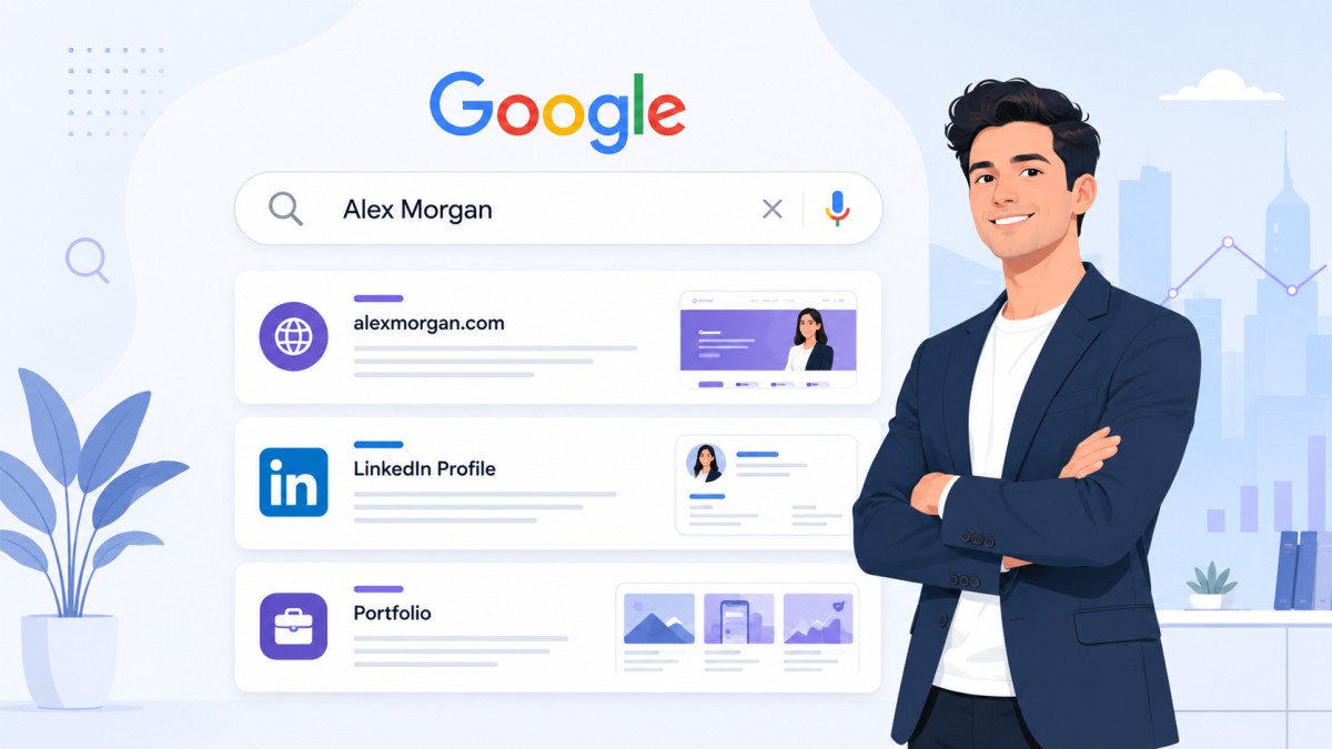
Clean meta tags and SEO (for Google discoverability)
Build a Page That Actually Converts — Free
If you're reading this and realizing your current page makes some (or all) of these mistakes, the good news is: you can fix everything in one afternoon.
MyEasyPage is built specifically to solve these problems:
Structured sections — bio, services, testimonials, portfolio, blog, shop, booking — all built in, no hacking required
Smart themes — 38 professionally designed themes, all mobile-first
Built-in SEO — Your page shows up on Google with clean meta tags and structured data
Conversion-ready — Highlighted CTAs, service cards with pricing, testimonial sections, contact forms
Always fresh — Blog, shop, and booking features keep your page alive and updated
Your page isnt a digital poster. Its a salesperson that works 24/7, handles every first impression, and either converts visitors into clients — or lets them walk away forever.
The difference between a page that gets compliments and a page that gets clients is the 7 fixes above.